Crypto
Swap & Earn
Website
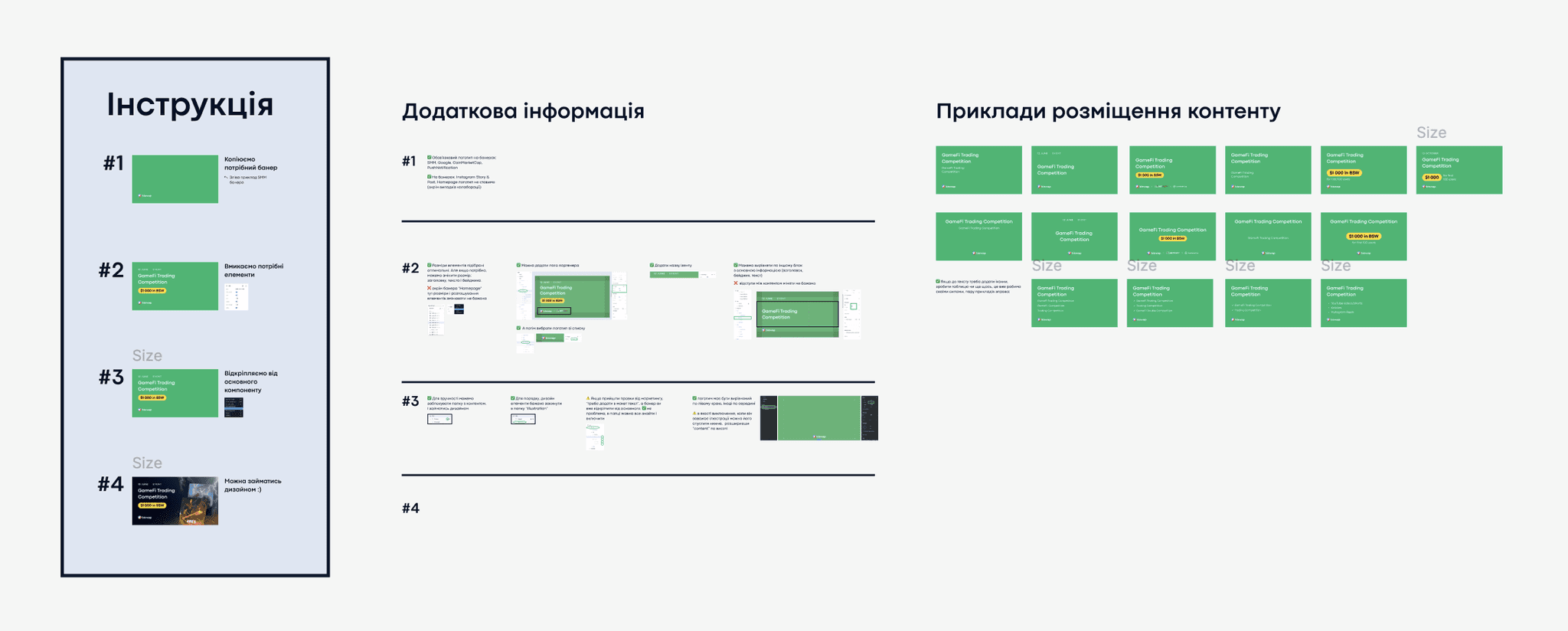
Design System Implementation for Marketing Banners
Challenge
The design department faced inefficiencies: several designers were working in different styles, which slowed down production and made it difficult for newcomers to adapt quickly.

Solution
I developed and implemented a design system that unified the visual approach, introduced clear guidelines, and optimized the workflow. I also collaborated with the SEO team to refine content strategy and supported accessibility standards in typography and layout.
Result
Banner production time reduced from ~2 days to 1–1.5 days.
Consistent style across all banners with reusable components and tested text sizes for readability.
Stronger alignment between design and SEO, resulting in clearer, more effective visuals.
Challenge
Users found it difficult to understand how the investment pool worked and how their contributions could generate profit. The lack of transparency and clear structure reduced trust and engagement.

Solution
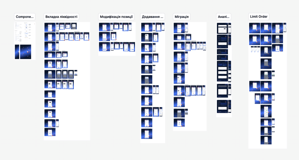
I proposed and designed a step-by-step visual structure showing what happens with user investments at each stage. This approach explained complex processes in simple terms and provided a clear journey of how investments turn into earnings.
Result
Improved user understanding and reduced friction when exploring investment opportunities.
Increased trust thanks to transparent communication of the process.
The Investing Pool successfully attracted and managed approximately $1,320,724.17 in total investments.
Challenge
After the success of version 2, which allowed basic liquidity adding with a simple structure, the new version (v3) introduced advanced functionality — the ability to choose a price range and add liquidity within that range. This required a clear UX approach to guide users through the more flexible, but also more complex, process.

Solution
I designed UX prototypes and interaction logic for the new functionality, mapping out the structure and flow of how users define their ranges and provide liquidity. The prototypes focused on keeping the process intuitive while accommodating the added flexibility.
Result
The new flow was successfully implemented and is now live, enabling users to add liquidity within a chosen price range.
Improved transparency and control for users, helping them better manage their strategies.
Established a scalable UX foundation for future iterations of the liquidity tool.
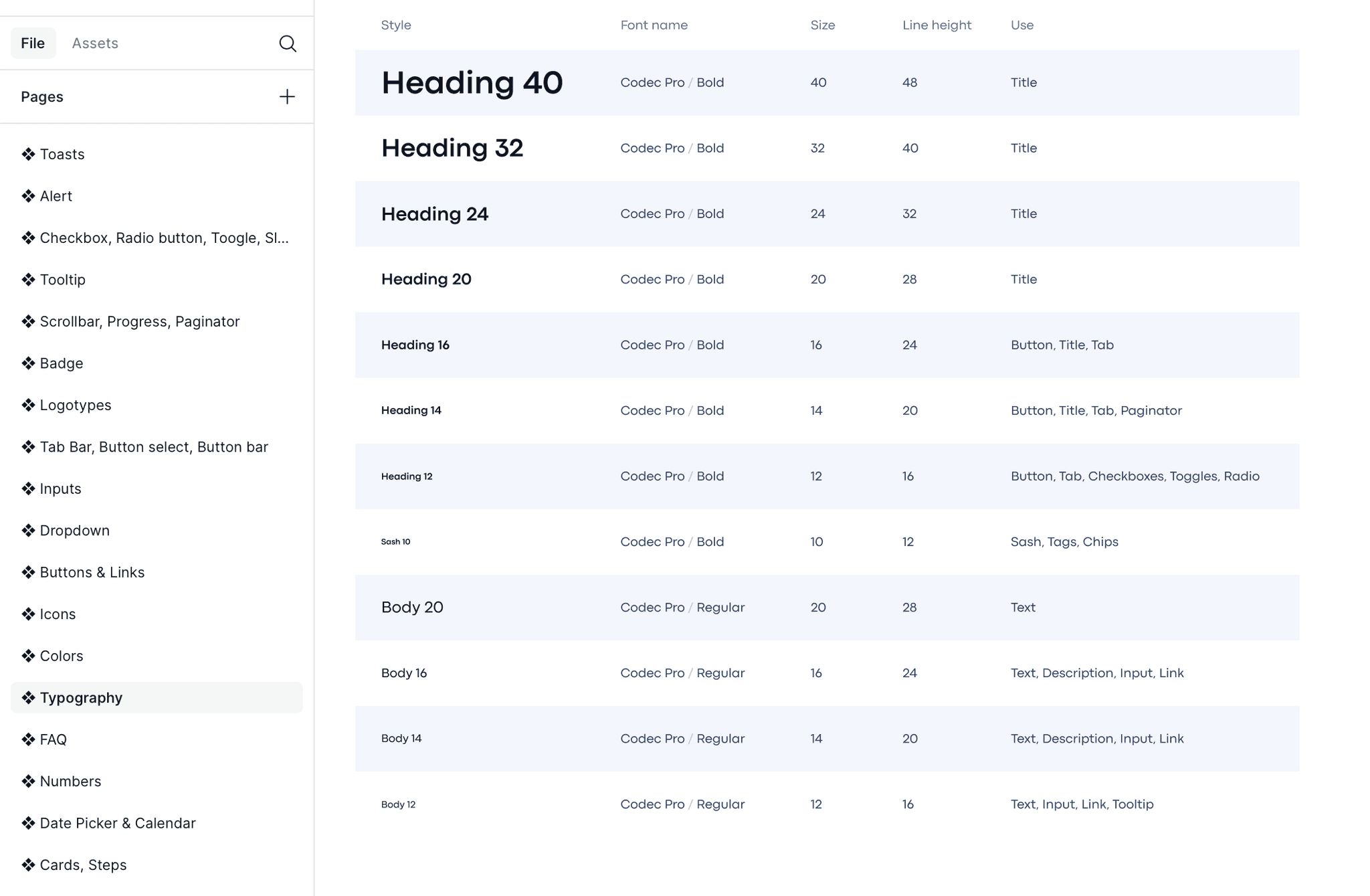
Design System for the Entire Product
Challenge
The product was growing rapidly, but the lack of a unified design approach made scaling difficult. Each new page required additional effort to align with previous ones, which slowed down delivery and created visual inconsistencies.

Solution
I built a comprehensive design system containing a wide range of reusable components, typography rules, color tokens, and interaction patterns. This system ensured that every new page could be created in a consistent style, while also reducing design and development overhead.
Result
Accelerated the creation of new pages and features thanks to ready-to-use components.
Achieved a consistent and professional look across the entire product.
Improved collaboration between design and development teams by providing clear documentation and guidelines.
Enabled easier onboarding of new designers — they could quickly start building within the established visual framework.
Laid the foundation for future scalability of the product without sacrificing quality.


